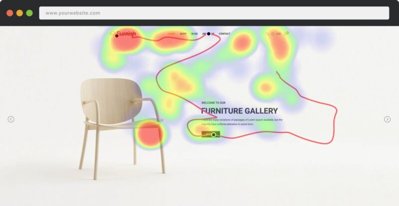
You can see the site heatmap like Creabl everywhere – in scientific studies, case studies, etc. Why?
Because a heat map is a great way to look at current trends through analytics, check the quality of landing page optimization, and determine what to do next.
Today, heat maps are used to present complex statistical data. Engineers, marketers, sociologists, and researchers all use heat maps to provide comprehensive comparative data.
Today, we will tell you why you need to use a site heatmap, and also tell you what tools you can use to create it.
What is a site heatmap?
A site heatmap is a tool that uses a color palette to visualize data on a graph. For example, if you’re looking at a web page and want to know which elements get the most attention, a heatmap will show that information based on the user data of that page’s visitors.
What does a heat map show?
A heatmap uses a color spectrum from warm to cool tones to showcase areas of a website page that attract users’ attention (warm tones get the most attention, cool tones the least).
Thus, a site heatmap is a great tool for visualizing analytical data and user web activity.
How does a heat map work?
The software works on the basis of data obtained from a web page.
Let’s give an example of working on one of the Western instruments.
First of all, when examining a web page, the service makes a statistical slice of the URL page that you want to check. When the HTML of the page is loaded, the downloaded version is passed to the web service server, thanks to the JavaScript portion of your site.
After that, the service creates a map of all the elements on your page that the user can interact with.
After that, the service starts collecting information about user activity. Each time a visitor interacts with a page, the information is transferred to a heatmap.
Types of site heatmaps
There are several types of heatmap tracking, depending on the functionality of the service that provides the data. Consider the most common of them.
Heat map
Classic variant. Using a thermal gradient shows the areas of the page that attract the most attention.
Scroll map
How long is your content? Do users read everything you write? Where is the best place to place a CTA button? Should you use longreads? Should I use an infinite scroll or add pagination? All these questions can be answered with the help of a scroll map.
Confetti
A rather specific version of the classic heat map. The map displays areas with user clicks, which vary depending on the color, type of action, etc.
Heatmaps: when to use them?
If you are doing marketing, content marketing, or you are interested in information about user actions on the site, we recommend using a heat map. Here are some scenarios where it can be useful:
- Website redesign. A website redesign can be a financial and labor-intensive process. The last thing you want to see is that the new design doesn’t work better than the old one. That’s what a heat map is worth using, tracking user behavior at each stage of change.
- A/B testing. Do you need to test several landing options and choose the best ones? Need to know where is the best place to place a CTA button? Check how well the elements are placed on the page among several options? A heat map is an essential tool for A/B testing.
- Content marketing. If you need to know the optimal content length or find out the best places in the test for placement of CTA buttons, use heat maps for this.


