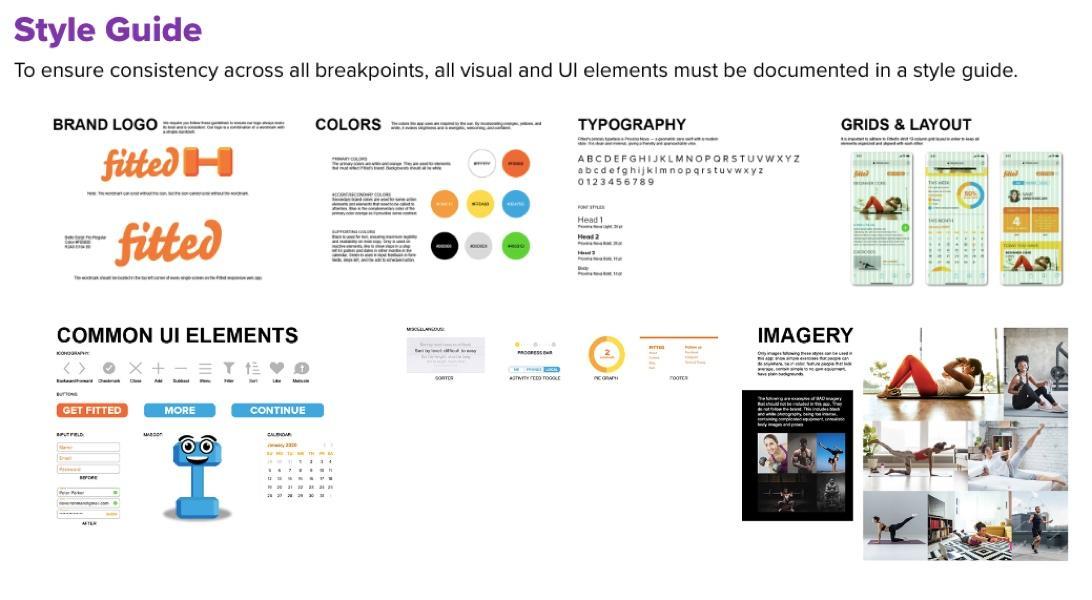
Every new project a web design team starts, be it an app or a website, possesses a unique style that should be consistently kept to. The guide is meant to direct every team member to better project comprehension, letting everyone work without losing that direction. Besides, the style guide communicates the project’s brand identity and contributes to a seamless user experience across channels and platforms of a business.
Thus, every expert UX design agency prioritizes style guide creation as one of the first steps in a new project. Here we provide handy instructions on what to include in this guide to lead your team through successful project completion.
Why Have a Guide, After All?
Once the general project specifications are discussed and approved, the temptation to start working right away is high. So, why stop for a while to compile the style guide? There are a few reasons not to neglect this preparatory stage.
Smoother front-end development
Many software development projects suffer from a lack of consistency between the design and development aspects. Thus, designers and coders often work in an isolated way, struggling to match their products in the end. With a style guide, programmers have a unified reference base for CSS and HTML guidelines, color codes, UI component templates, SVG files, and a whole lot of other super useful things.
More consistency in UX work
UX designers also often refer to the style guide to ensure that their layouts are consistent with the broader brand style and visual elements. Such an approach yields better consistency in design, matching the new product with the existing channels of the brand.
Style consistency across channels
Style guides are also informative for experts not related to the development aspect of project work. For instance, SMM specialists can refer to the guide to derive ideas for banners and social media imagery, while writers can harmonize the copy for the brand’s project with its visual style and tone.
As you can see, a style guide is a valuable source of data about the brand for all parts of the team. As a result of having a single, consistent source of information, you won’t face project delays and misinterpretations. So, it’s vital to invest some time and effort into producing a comprehensive, detailed reference guiding everyone at each step.
Vital Components of a Style Guide
What should you include in the style guide as a mandatory minimum for your dev team? Here are a couple of suggestions.
#1 Typography
Typography is essentially about your fonts and font size. Obviously, choosing the right font for your project may take forever, but we won’t cover this here. Let’s assume that you’ve already chosen a font. Your guide should cover:
The minimal legible font size
Instructions for font pairing (if you use 2 fonts in one design)
Specifications for font sizes for titles, subheadings, and paragraph text
#2 Colors
The color palette of a digital project can be very extensive, as you may have numerous screens and features in one product. To make things clear, you need to agree on the uniform terminology with the team. For instance, you can have a primary and secondary color palette, a separate section with text colors, etc.
Experts recommend focusing only on two primary colors for a web project. However, it doesn’t mean that you will use those colors in their original form throughout. Every hex code of color contains various shade and intensity variants to choose from. Thus, you can achieve great visual diversity even with two color variants.
Don’t forget about system colors; these relate to the elements displaying warnings, errors, system information, and notifying the user about the success of their action.
It’s also recommended to specify which color will be used with each UI element. These include CTA buttons, links, page headers, and interactive elements of the page.

#3 UI Features
The discussion of UI elements and features can take ages, as they differ broadly across apps and digital product types. Let’s focus on the general components that a typical UI guide may cover:
- Buttons
- Contact/feedback/ordering forms
- Icons
- Toolbars
- Menu
- Lists
- Steppers
- Modals
Don’t forget that all UI elements should look refined, polished, and ideal for creating a positive impression on the user. Their combination should produce a holistic effect on the visitor consistent with the brand’s image and intended message. Every component should be intuitive and self-explanatory. In other words, it shouldn’t cause the user confusion about what will happen if they swipe or click something.
#4 Images
Don’t underscore the value of imagery in the style guide. Non-verbal communication is known for a more pronounced emotional effect, so many brands make an exclusive emphasis on this style element. For many people, it’s much easier to embrace the brand’s identity and message by looking at its images rather than reading words.
When you include a reference database of brand images into the style guide, you allow every team member to embrace the intended message and get a consistent feel of what the app should look like. In addition, images always serve as extra visual hints in terms of style and color choice. Thus, you can get the rest of the style guide ready much quicker, starting with image references.
#5 Design Instructions
A style guide’s visual content may turn into a senseless set of images and icons if the team doesn’t get clear, user-friendly instructions for their implementation. Thus, it’s vital not to ignore a detailed table of contents and context notes in every style guide. With these pointers, you will simplify the guide’s use for the entire team, minimizing the risk of misinterpretation and reducing the amount of time one needs to get the needed data.
Style Guides Make Work Simpler
As you might see, having a clear and detailed step-by-step guide is a huge time-saver for development teams. It can become an essential negotiation reference for clients and developers, ensuring that everyone is on the same page with the project vision. Thus, it saves tons of time, money, and nerves for all stakeholders, helping develop stellar projects without critical flaws.


